Monitor Engagement with the User Behavior Dashboard

The User Behavior dashboard gives you a better understanding of how long users engage with your content, either actively or passively. By breaking down which content is popular vs. which is unpopular, you can take proactive steps to reduce churn or focus your resources on your most useful features.
The User Behaviour dashboard is part of PubNub Insights, a feature that aggregates data for your account and all your apps, giving you insights into your data (hence the name) when it can be challenging to see the ‘big picture.’ If you want a high-level explanation of the User Behaviour dashboard, then the dashboard documentation will explain what each of the charts mean; this article will examine how the User Behavior dashboard is useful for a variety of different solutions and how to interpret the data depending on what type of app you have created.
User Behavior Dashboard Overview
At a high level, the User Behavior dashboard will let you see how long users stay connected to channels over time. How you define what a ‘user’ is and what a ‘channel’ is will depend on your application and use cases.
Let’s consider four solutions that are popularly built by customers using PubNub, and see how the User Behavior Dashboard can help those customers:
In-App Chat - Either 1:1 or group chat, send messages and exchange files.
Live Events - Watch and interact with a live stream and chat at scale, with live polling and other interactive content such as reactions.
Geolocation and Dispatch - Track vehicles or orders and take action in real time to ensure efficient routing and driver communication.
IoT Device Control - Receive real-time data from sensors, and understand the health of your devices.
Note that the User Behavior dashboard is only available to Insights Premium customers.
Average User Duration
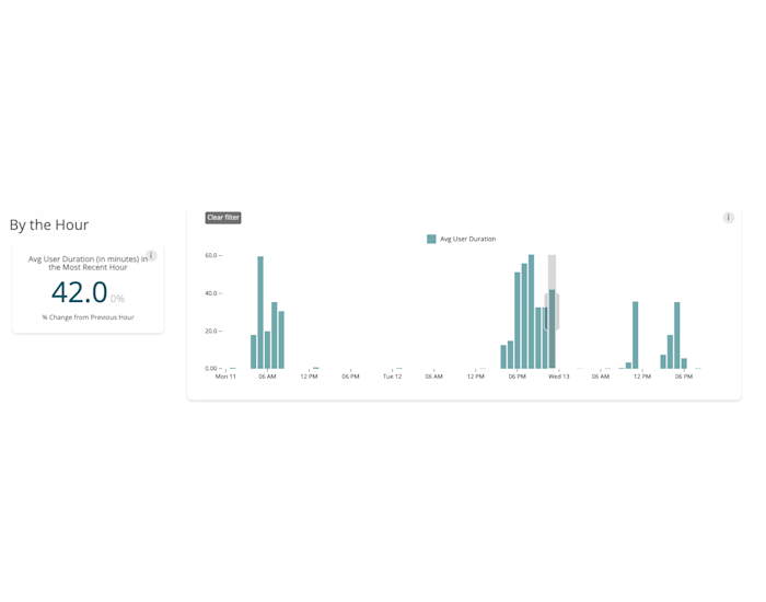
The section at the top of the dashboard provides the average user duration broken down by hour within the selected date range. The percentage next to the number compares the change between the selected hour and the previous hour.

So, the horizontal axis is time, with each bar representing an hour. The vertical axis is the average user duration within that hour in minutes. So, if between the hours of 0300 & 0400, you have two users interacting with your application for 20 minutes and 30 minutes respectively, that bar will have a value of 25.
Q: Duration of what???
The dashboard measures user connectivity, specifically whether a user is subscribed to a channel. This dashboard does not break down which channel the user is connected to; it just considers the maximum, so being connected to one channel for 10 minutes and one channel for 20 minutes will report a value of ‘20’ for that user.
Q: What is a user?
A user refers to a PubNub user, meaning a client with a unique user ID.
For In-App Chat: Channels will represent a conversation between 2 or more participants. The average user duration will measure how long users engage with your application. For a customer support application, for example, these figures could measure how long it took to resolve a user’s issue and whether that duration is consistent over a 24-hour period. You could also examine whether users are more likely to engage for longer at certain times of the day.
For Live Events: Depending on the event, you might have all your participants in a single channel, or you might shard participants across multiple channels, but this dashboard will aggregate all your users into a single view. You can measure how popular the stream is compared to other streams: how long users were engaged with your live chat stream sending messages or reacting.
For Geolocation and Dispatch: It is very common for geolocation customers to use PubNub to report location information (lat / long) as messages on a channel, with each channel representing a different vehicle. In this case, you would expect constant activity on a channel during a driver’s shift, and if the user duration drops below 60 minutes/hour, an investigation is needed to understand why messages are not being received (perhaps there are a lot of tunnels)
For IoT Device Control: Each IoT device is considered a unique ‘user,’ and each reports sensor readings over a channel. You might have multiple devices sharing a single channel, or each device might have its own channel. Still, in a correctly functioning solution, you would expect the average user duration to be constant or at least predictable. If the average user duration strays away from the expected reporting cycle, then it might indicate a malfunctioning IoT device.
Unique Users by Duration Timeframe
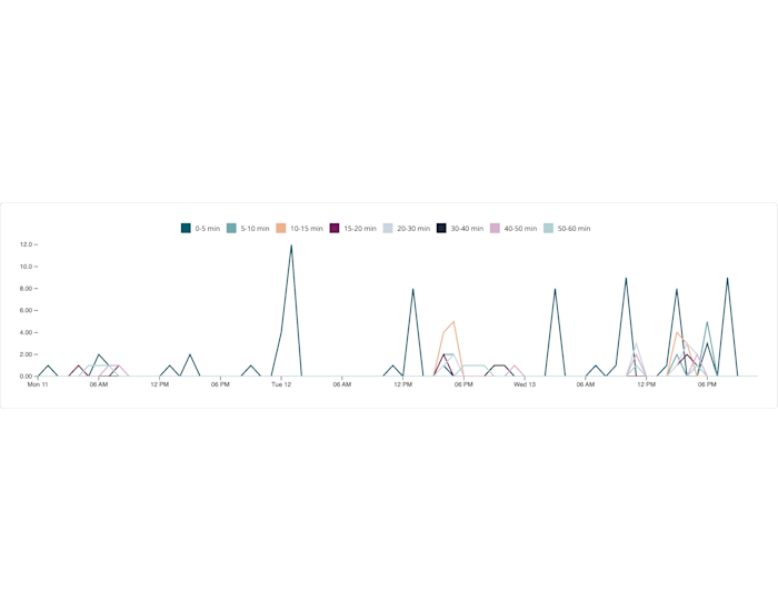
The Unique Users by Duration Timeframe graph shows the number of unique users engaged with your application, broken down by hour, and how long that engagement lasted. So, you can see how many users were connected for 15-20 minutes in a given hour, for example.

Q: Duration of What??? What is a Unique User?
The definitions of ‘duration’ and ‘user’ are identical to those used in the previous graph. This dashboard measures the timespan that a unique PubNub user is subscribed to any channel in your application.
For In-App Chat: This graph is very useful to understand whether your chats last for a predictable duration. To take the previous example of a customer support application, you could use this dashboard to answer, “Does it take roughly the same amount of time to deal with each support request?”, “Are there outliers, where some support requests take a long time to resolve?”, “Does the time taken to resolve requests change depending on the time of day?”
For Live Events: Let’s say your live event lasts for two hours; this dashboard gives insight into how many people were engaged for the entire stream vs. how many were only engaged at the beginning. You will also see spikes in your data, which indicate participants engaging for short bursts of time, and you can use that to review which parts of the stream were most engaging so that you can duplicate that in the future. The height of the highest peak will indicate the total number of people who engaged with your steam.
For Geolocation and Dispatch: When discussing the previous dashboard, we said that if you use PubNub to exchange location data, you would expect a near continuous connection since location data is expected to be received regularly. This graph could help you drill down to understanding any anomalies; for example, if the average user duration is less than 60 minutes/hour, is that caused by several outliers skewing your data in the 0-5 minute bucket, or is your entire driver base sitting at the 30-40 minute bucket for some reason.
For IoT Device Control: In the previous dashboard, we expected “the average user duration to be constant, or at least predictable.” This graph allows you to drill into whether your data is ‘predictable,’ i.e., if your IoT sensors are only expected to ‘call home’ twice every hour, you would expect all your users to be within the 0-5 minute bucket. If you see devices in the 5-10 minute bucket it would indicate a malfunctioning device that needs to be investigated.
Top 20 Channels with User Duration by Hour
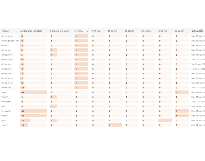
The previous two dashboards aggregated user duration across ALL of the channels in your application. Using the final dashboard, you can drill down to understand which of your channels are contributing to that user duration tally.
The dashboard can be a bit overwhelming at first glance, but it contains much useful information that can be viewed from different perspectives.
Some tips:
Use the ‘Date and Hour’ drop-down if you are only interested in a specific hour of time.
Use the timezone selector at the very bottom right of the page to ensure you are looking at the time that is relevant to your event, especially if you have global customers.
Reorder the columns by selecting the heading and noting which direction the arrow points for ascending or descending data; this way, you can influence what you consider a ‘Top 20 channel’. Take caution: Only one column should be ordered at a time, be sure to remove the order on one column before applying an ordering on another column.
Use the category selector to group data together. For example, if you have wildcard channels (Channel.*), you will see multiple rows for these in the table, which can be collapsed by selecting a category.
The bar in the ‘Avg Duration (minutes)’ column represents minutes in the range 0-60 and is equivalent to the ‘Average User Duration’ dashboard. The other columns represent the number of users who fall into that 5-minute bucket, so the first column is not directly comparable with the other columns.

For In-App Chat: Your in-app chat application will use individual channels to maintain each conversation. To continue the support application example used previously, assuming you have a predictable channel naming convention, this dashboard can identify outstanding support personnel based on their channel IDs. For example, support agents who efficiently complete chats consistently within a short window, as well as those agents able to provide a more patient and extended support window to those who need it, can be identified.
For Live Events: Most live events will not add every participant to the same channel, especially as events get very large, but participants will be grouped based on attributes such as language or the team they support. As audience members are grouped, they will be on separate channels, and you can use this to gain greater insights; for example, do audience members speaking one language contribute more than those speaking another? Channels aren’t just used to segregate your audience however, you might use different channels to deliver polls or other interactive features, and you can use this dashboard to evaluate how much engagement those interactive features received.
For Geolocation and Dispatch: The previous two dashboards spoke about using PubNub to exchange vehicle location data (lat/long), but transport and logistics solutions also use PubNub to exchange other data such as route info, rerouting requests, driver chat and feedback, push notifications and geofencing alerts. Since non-location data will be exchanged over different PubNub channels, you can use this dashboard to filter it out and give you insight into all the data you are exchanging, without being overwhelmed by vehicle location updates.
For IoT Device Control: When choosing a channel topology and naming convention, it is common to assign each device its own channel but namespace these channels so they can be efficiently subscribed to. For example, the screenshot above groups devices by ‘device.*’, and you can see devices ‘device.sim_1’, ‘device.sim_2’, etc. Whereas the other dashboards discussed here only gave you an overall view of your solution, this dashboard allows you to drill into the individual device, which is especially useful as you investigate anomalous data.
Summary
Regardless of what sort of application you have developed with PubNub, the User Behaviour dashboard can give you a better understanding of how your users engage with your content, either actively (such as messages in a group chat) or passively (such as an IoT sensor reporting data). By better understanding your users and identifying anomalous data early, you can reduce churn and focus your development efforts on those features that your user base finds the most valuable.
For more information, please see our User Behaviour dashboard documentation. If you need help or support, feel free to reach out to our dedicated support team or email our developer relations team at devrel@pubnub.com