Make Sure Users Love your Next Big App or Feature

You can use PubNub Insights to understand how your users interact with your application, what your most popular features are, and which areas of your app might need improvement. By presenting you with a series of dashboards that require little or no setup, PubNub insights can show you where your users are located; what they are doing in your application and, ultimately, allow you to make evidence-based decisions on how to evolve your app.
Crucially, PubNub Insights requires zero code to set up and provides a deep context into how your users experience your app, all without needing to understand the low-level detail or API calls.
The information in this guide is equally applicable to both ‘Standard’ and ‘Premium’ dashboards but bear in mind that Premium dashboards offer additional data granularity, making it possible to gain insights over a longer period of time.
Understand your Application and Identify Potential Improvements
Before planning any improvements to your app, it is important to understand the current state: how is it being used? And who is using it?
The Snapshot Dashboard
The landing page for PubNub Insights is the ‘Snapshot’ dashboard which provides a general overview of the number of unique users, channels, and messages used by your app as well as a breakdown of where in the world the messages were being sent from, and where the users are who sent them.
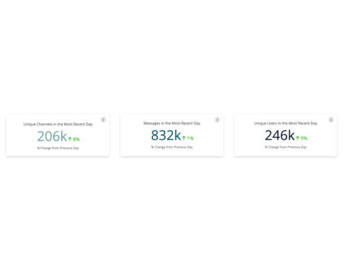
The big numbers at the top of the Snapshot dashboard give you both an overview of your application’s activity and your first hint that the application is performing as expected. By comparing the numbers relatively, you can see the average number of messages sent by each user or the average number of messages in each channel - do these align with your expectations? The percentage difference is also shown compared with the previous day, and any large increases or decreases can be investigated further by exporting the data or monitored more closely by setting an alert.
As the name implies, the Snapshot dashboard will give you the immediate numbers, but to understand trends, you should head to one of the ‘Channels,’ ‘Users,’ or ‘Messages’ dashboards to see how the respective data has changed over time.
The Messages Dashboard
The Messages dashboard can help you understand the different types of messages your application users are sending; for example, there might be:
A chat message exchanged between support and the end user
Messages exchanged between users
An update to an order status
A note was added to the order.
The exact types of messages will vary from application to application, but understanding message trends can help you understand how frequently your app’s different features are being used and if interest changes over time.
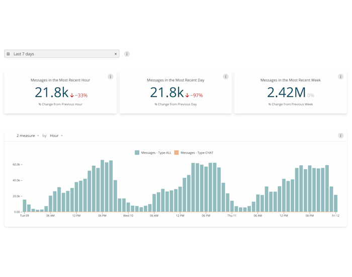
The messages dashboard will also show you the geographic location with the highest message activity, which can help area managers better understand their region and assist with Marketing efforts. For example, if you want to expand into the Asian market but are unsure where to focus, PubNub Insights can show you which Asian countries publish the most messages, allowing you to tailor an effective marketing strategy.
Another popular use of the dashboard amongst our live event customers (who deal with large bursts of data) is to use the dashboard to measure engagement throughout the event and compare it with similar events they have organized previously. This allows administrators to plan for upcoming live streams and predict future loads based on historical averages.
A more detailed view of the “types” of messages being exchanged is also provided on the Messages dashboard. You can either accept the default, which, assuming you have followed the payload type conventions, will automatically categorize your messages into sensible payload types, or you can define custom types in JSON.
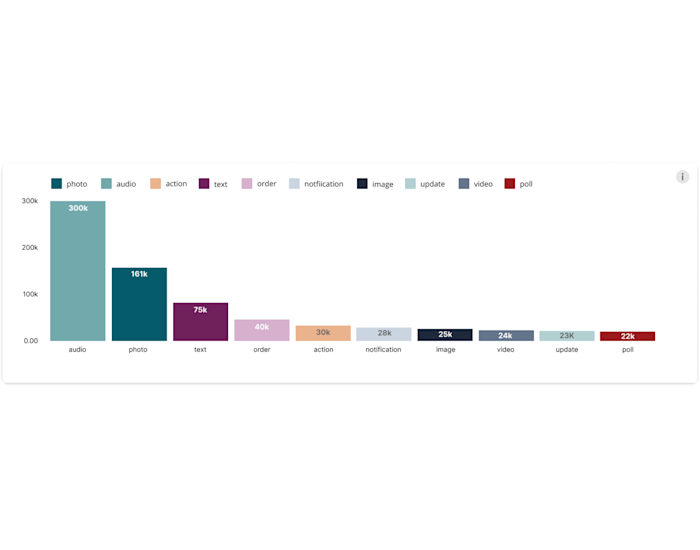
By assigning types to messages, you can derive context from those messages and ask more specific questions such as, how many files are sent? What sort of conversations are my users having? Or, Is there a correlation between popular channels and popular message types?
With custom message types, you can also start to run some A/B testing: What happens to my user growth if I encourage them to send more ‘Image’ messages? How is my channel usage impacted if I lower my ‘notification’ messages? If I retire my ‘update’ messages, does it impact the user experience?
The Channels Dashboard
To get a better understanding of your product features, you can use the Channels dashboard.
Typically applications will use a channel naming scheme that can be easily mapped to features, live events, or rooms; for example, the “group.room123” is likely a group chat, or “command.device123” is probably a message to an IoT device. This provides a simple correlation between channels and features automatically by following a logical best practice.
The channels dashboard is customizable but, by default, will display a breakdown of which channels contain (chat) messages over time as well as the top 20 most popular channels in a given time period. This allows you to see which features resonate with your users. Because PubNub Insights requires no code to set up, it can be used by product managers and business owners to measure the success of prototyping or user trials without having to rely on engineering to set up analytics queries.
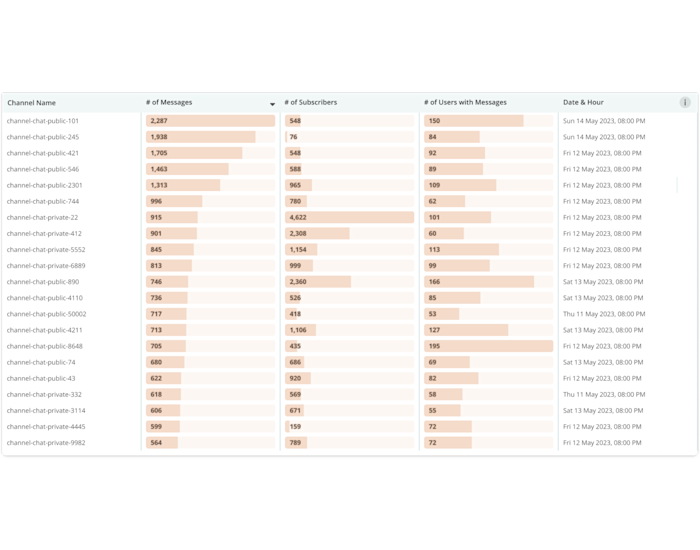
You can also identify features that are barely used with the channels dashboards - this helps you investigate unpopular features and decide which should be improved and which features can be potentially retired to save costs.
Channels do not have just to represent features but can also identify and evaluate chat participants. Support chat (helpdesk) apps will associate a member of support staff with a unique channel, meaning PubNub Insights can easily identify the most communicative members of staff across the chosen timescale, making it trivial to determine the most engaging support person of the day, week or month.
The Users Dashboard
Many of our customers have a thorough understanding of their users since user satisfaction is key. However, PubNub Insights can still help you better understand your users' behavior, especially by giving a bird's-eye view of how your users are interacting with your app's features.
The Users dashboard will break down the number of unique users per hour over a given time period as well as your most prolific returning users. This can help identify trends between the most active users and which features (or channels) they use, identifying which features appeal to the most profitable users.
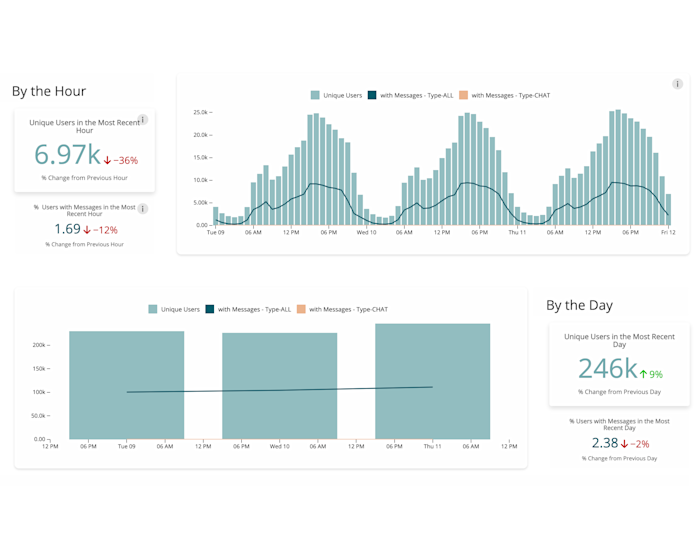
The Users dashboard can also help you validate your forecast expectations. For example, did a recent product feature launch gain the expected number of additional new users? Or, in the case of SAAS customers, did the usage numbers increase as expected after onboarding a new big customer?
Where in the world are your users?
Both the Snapshot and Messages dashboards will display the physical location where events are taking place, and you can see where your users are and where messages are being exchanged. This allows you to take a geographic slice into your data: say, for example, you see adoption rates of your app varying from country to country (or from city to city within the same country); this can be correlated to campaign data to see if marketing campaigns have been successful for their targeted region.
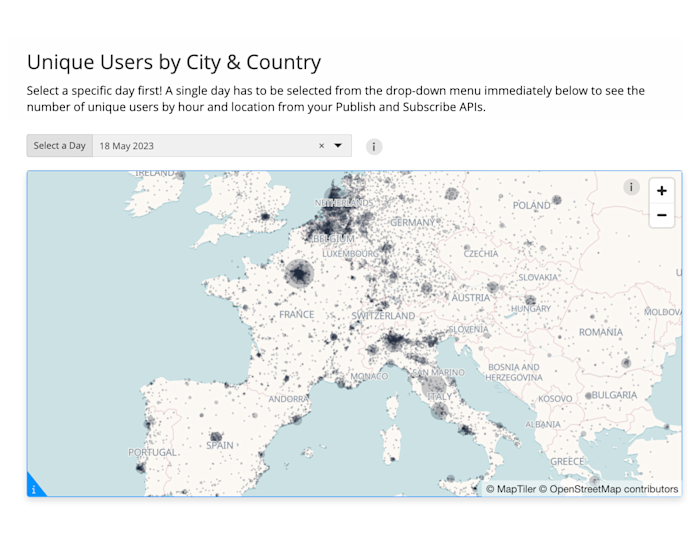
You might also use the PubNub Insights data to see that some States are ‘chattier’ than others or notice that some regions are under-represented amongst your user base. Now you know this information you can start to look for patterns; Product teams could work on localization to drive engagement, and potentially a marketing campaign could be composed to raise awareness in the under-performing regions.
Resource allocation across different time zones is another challenge that many companies face. It can be very difficult to match the level of resources to where your customers are physically located, especially when planning for expected demand spikes. By better understanding which countries your customers are in, PubNub Insights allows you to allocate resources more intelligently and ensure your application can run 24/7 without interruptions.
Another area where PubNub Insights can highlight potentially misleading data is with a customer’s self-reported location. For example, if your customer is in Japan, but their call center is in the Philippines, you can see this with PubNub Insights and can choose a more appropriate time to send out marketing information or schedule system downtime.
Summary
Regardless of your industry or use case, PubNub Insights allows you to easily drill into your PubNub data to understand the “big picture” without worrying about the underlying API calls or having your engineering team generate custom analytics data. PubNub Insights offers turnkey metrics and analytics built from your PubNub data and utilization without writing a single line of code, allowing you to see how users are experiencing your app as well as highlight potential performance issues.
PubNub Insights is automatically available to PubNub customers on the Starter and Pro plans through PubNub’s Admin Portal.
To use the tool, first log in and select “Insights” from the left-hand menu, then follow the prompts to select an application and keyset to analyze. To learn more, you can also visit our Insights docs pages.